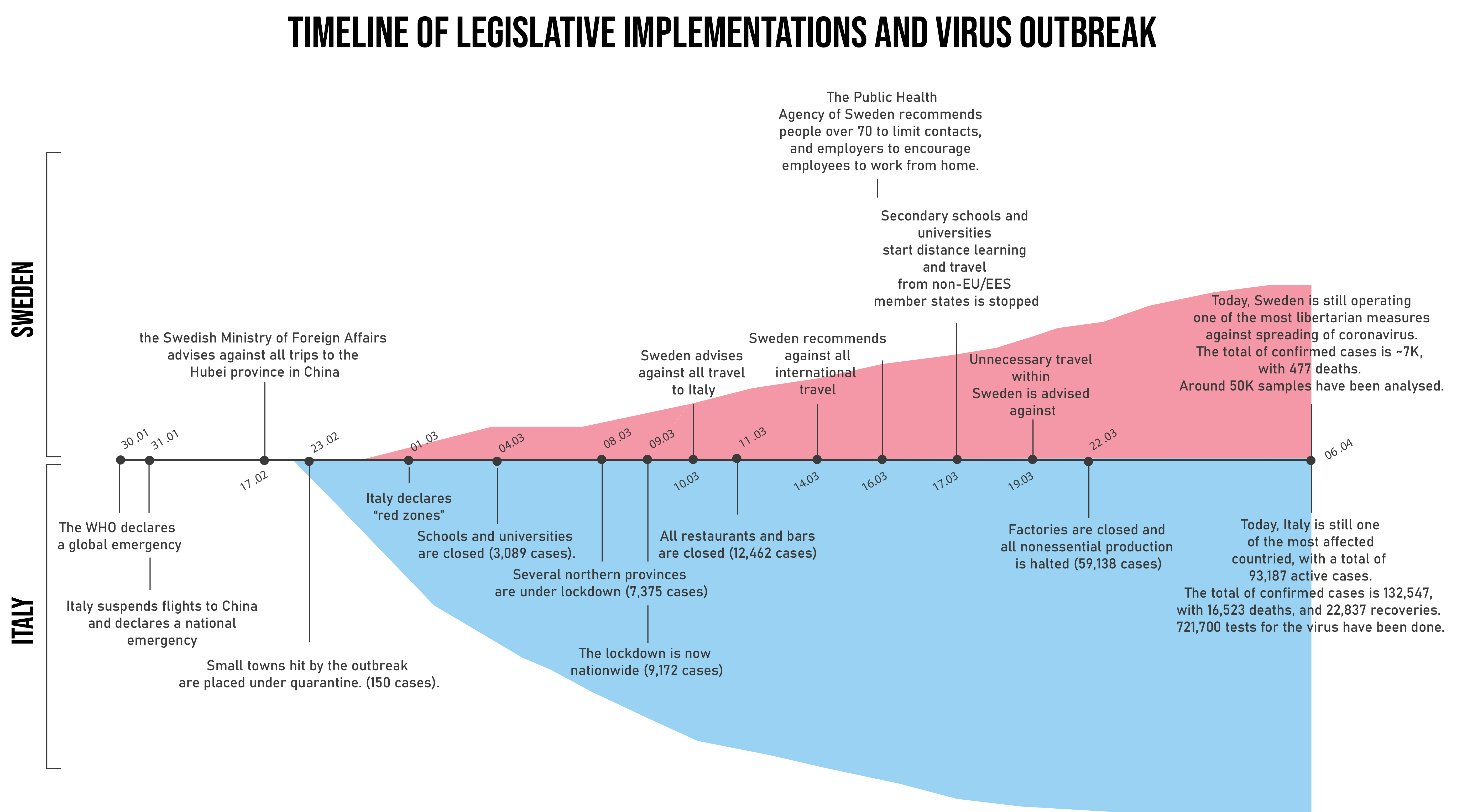
They could not have had it more different. On the one hand, a country on its knees, seeking ways to mourn its dead, patiently waiting for the quarantine lockdown to be over in order to make a living once again. On the other hand, a nation where you can barely tell a global pandemic is under way, where life carries on seemingly normally. Italy and Sweden are somewhat exceptions to the coronavirus crisis that has dominated the world´s scene for much of 2020, with Italy being the hardest hit country by the virus, and Sweden by operating a libertarian-type of legislative action, where minimal restrictive measure have been imposed, unlike its Scandinavian neighbours. Please note that this analysis runs up until the 6th April 2020.
Cross-country comparisons are hard to make because countries have different testing approaches and interventions, and also due to differences in demographics, population density, genetics and civil response to the outbreak. Italy has, proportionally, a lot more older people than Sweden. The cultures, additionally, are based on different ways to live, interact and salute, where Swedes probably maintain more personal space than their Mediterranean counterpart. Sweden, for example, has the highest proportion of one single household in Europe, and in fact half of the country´s homes are made up of only one person. All in all, then, Sweden´s choice to place responsibility on the public to display common sense and follow general guidelines, might seem a little less crazy. And yet around the globe it is hard, for many, to understand why Swedish people are still going eating out, to school and clothing shopping. The hardest restriction the government has imposed is a ban on gatherings of over 50 people. Hardly a restriction, would say an Italian who has been indoors for a month, unable to meet any friends and relatives. Yet, Swedes seem content following governmental guidelines, a lot of people are now working from home and there has been a significant decrease in the number of people commuting and travelling across the country. However, many are reluctant, after a long dark winter, to stay inside during the first longer and sunny days of the year, with some thinking that a lockdown could have detrimental consequences on mental health. The question is, will Swedish sense of responsibility allow for a sufficiently slow spreading rate that the mortality will not be too high and, most importantly, the healthcare system will be able to cope?
Providing informative, and more importantly, not misleading statistics on coronavirus is a challenge at the heart of many data journalists like me. For every graph I have made, I have recognised at least one flaw, some of which are based on the statistics and some on the data. In this section I am going to compare visually the coronavirus outbreak in Sweden and Italy, adopting various types of charts, pointing out strengths and weaknesses of each of them and the data behind them. Whilst there is a bunch of people out there who like me believe in the power of data-storytelling, we have to recognise that the challenge of getting the perfect data is beyond vincible, especially given we were probably far from prepared for this global pandemic. Let´s discuss the data: who counts as a positive case of coronavirus in our datasets? Who are these 132547 people in Italy and 6830 in Sweden? One thing is most certain - they are not at all the exact estimate of individuals who have contracted the virus since its outbreak. If anything, the most accurate definition of that estimate is "the sum of all individuals within a country who has been diagnosed and confirmed as positive to the virus as per defined by the WHO declaration of symptoms, dependent though on each country´s capabilitiy to detect the virus, and each government´s choice on who to test, considering age groups, the general population, symptomatic people, healthcare workers and hospitalised indivduals".
Following this definition, and given that we know a lot of people are asymptomatic despite having the virus, we can safely say the real number of cases is most likely higher than the published estimates. By how much? Impossible to say. Whilst it is easy to think that counting the dead is a much safer job, it becomes apparent, when comparing across different countries and noticing much steeper death rates by cases in some of them, that the numbers are skewed there too. An explanation of this could be that some deaths go uncounted as due to coronavirus, as different nations counts cases in its own way. Secondly, different healthcare systems with varying resources and capacities lead to differential outcomes in survival rates. Finally, each country is at a different stage of the outbreak, making the number of deaths by cumulative cases highly unreliable. For instance, Italy has seen an increase in deaths only a few weeks after the steep increase of new declared cases. Similar patterns in other hard hit nations, such as France, Spain and Germany, indicate that only time will tell how deadly coronavirus is, and how we can truly compare differential death rates in various nations, given their restrictive measures and healthcare systems. Whilst all the aforementioned factors make for a pointless comparison article, I still think it can be interesting to see how much the spreading is differing between Italy and Sweden, provided their measures and healthcare systems are quite differential. I do acknowledge that the best is yet to come, in relation to studying the pandemic impact on Sweden and Italy, given that Italy has only now begun mentioning reaching its peak, whilst Sweden is far from reaching it. I am curious to see how today´s numbers will compare to the final estimates once the pandemic is over.
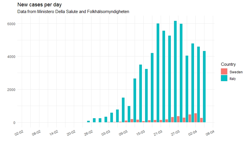
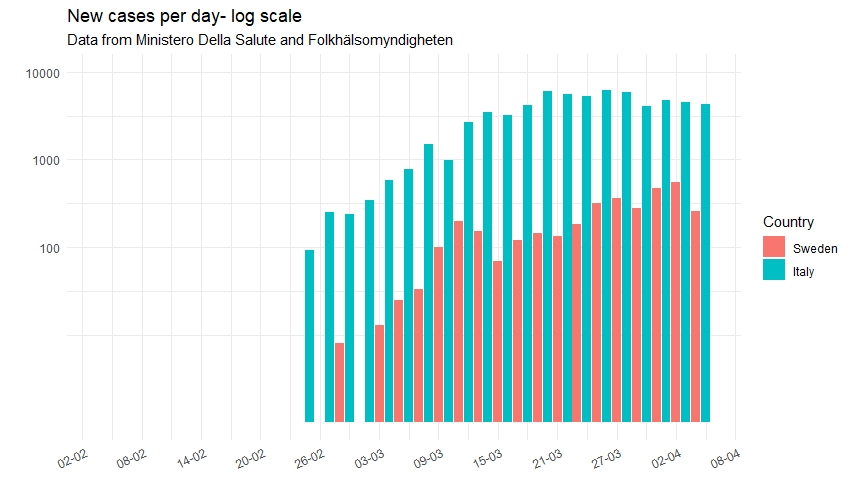
WHAT IS MORE RELIABLE TO LOOK AT, CASES OR DEATHS? They both have their strengths and weaknesses. Cases are a good indication of the current situation, given that death peaks happen a bit later in time, and Sweden is yet to experience it. Yet, cases are somewhat unreliable due to varying testing rates. Similarly, however, there could be many deaths which, as per each country´s measures, simply go unreported as deaths by coronavirus. Some might notice the plots below are not normalised, meaning they are not adjusted by population size. Whislt the choice might seem odd, there is a good reason for it: normalised plots can tell how much a country is under pressure by the virus, but is of little use when comparing the spread of the virus cross-nationally, as the virus spreads exponentially regardless.
NEW CASES PER DAY To show the absolute number of new cases reported each day in Italy and Sweden, I have created two plots. The first one shows the new number of cases on a linear scale, whereas the second one shows the same numbers but on a logarithmic scale. In the y-axis of a so-called log scale, the distance between 0 and 100 and between 100 and 1000 is the same, meaning that if we were to observe a straight line in the data, we would be looking at exponential growth.
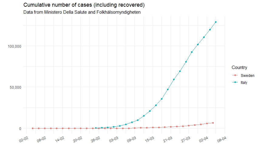
The cumulative number of cases are plotted, like before, on a linear scale and on a log scale. Italy has a considerably higher number of cases than Sweden, although the figure in the latter country is increasing more and more each day.
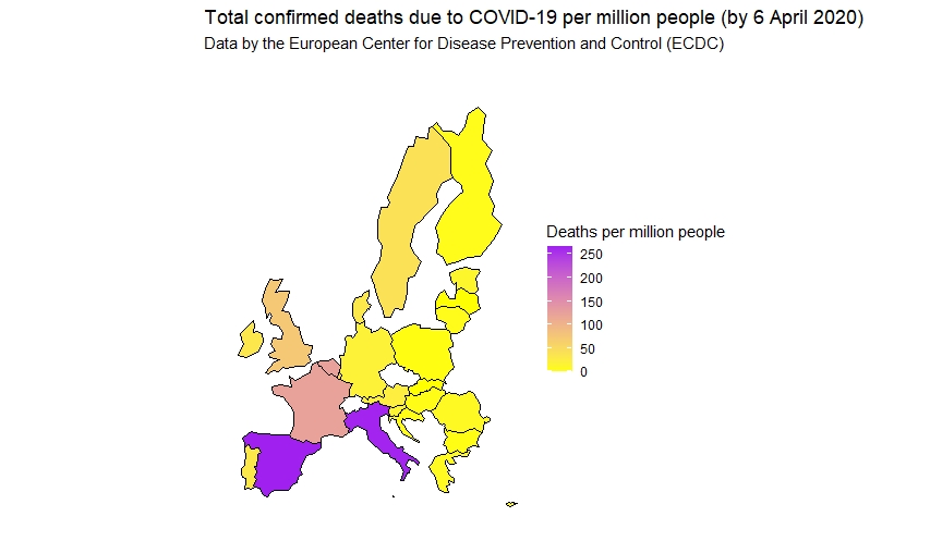
DEATHS PER MILLION The map below shows death by COVID-19 per million people in several European countries. Italy and Spain are the hardest hit, and currently Sweden has a much lower death per million people than Italy. However, compared to other European countries that have imposed lockdowns, Sweden has a somewhat higher death per million rate, which is not so surprising given the legislative measures chosen by the Scandinavian country´s government.
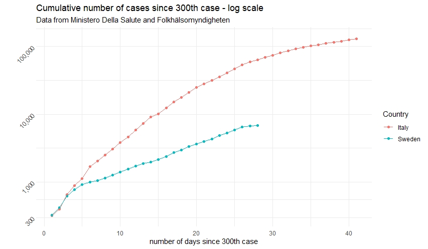
The following graph is probably the most interesting one to look at if you want to get a clear indication on whether Sweden is on the same course as Italy in terms of virus spread. The graph shows the total number of cases (cumulative) on a log scale since the 300th case. As we can see, it seems that virus spreading is stronger in Italy, yet things still might change for Sweden given Italy is much later in the outbreak stage. However, this graph points out that, perhaps, Sweden´s legislative measures that have caused so much polarisation globally were not so outragiously wrong. It will be interesting to see how the virus spreading will progress in the Nordic country, especially following Easter week, where more people are expected to travel and visit relatives across the nation. One thing is sure: once the waters will be quieter, the world will look at outcomes of virus spreading, death tolls and long-term economic consequences in Italy and Sweden, and make it a case for comparison.
data until 6th April 2020
This piece was made thanks to publicly available data from the Italian Ministero della Salute, the data of which was accessed through this GitHub repository: https://github.com/pcm-dpc/COVID-19, whereas Swedish data was accessed through the Folkhälsomyndigheten website: https://www.folkhalsomyndigheten.se/smittskydd-beredskap/utbrott/aktuella-utbrott/covid-19/bekraftade-fall-i-sverige . The analysis was made using R, in the RStudio interface. The plots involved some data manipulation, for which I have availed of the popular Tidyverse package. I would have loved to extend the study to number of tests per country, but such information was missing from my datasets.